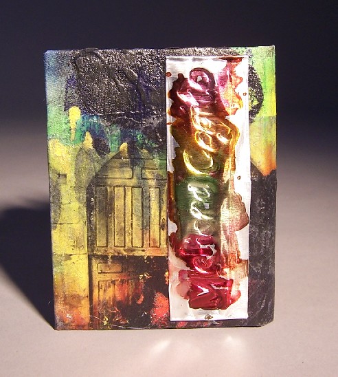
 For the cloth of this book, I used thin, rainbow tie-dyed cotton. I added black gesso just as I did to the other two books in this series. Again I wanted to experiment with photo transfers, so I transferred the images of a poritco (front cover) and gate (back cover) using acrylic medium. I love these images, but didn’t want to just leave it at that.
I had the inside of the crow from the stencil, so I adhered it to the cover, hoping it would serve as a focal point. Unfortunately, it got lost in all that black, so I did the spiral design with red paint marker. Then, to make sure the edges didn’t buckle from the glue, I laid wax paper over it and put a weight on it. Uh oh. The edges of the crow stuck to the wax paper, and lost some of their culture. I”m not sure if this is a bug or a feature, but I’m leaning toward the former. Not yet sure how to fix it, but I may yet tinker with this.
The metal work on the back was to satisfy my “stuff for the fingers to feel” urge. I started with medium weight aluminum sheeting, and looked up latin phrases on the internet. I think this one means something like “I strive to improve.” Latin isn’t just for webtemplates anymore! After I found a good, short, phrase, I picked a font from my calligraphy book and used my incising tools to impress the metal. The glue on the back should keep it from flattening too badly, I hope. The inks are alcohol-based inks, good for non-porous surfaces. I believe that with time the ink will get rubbed off everywhere but the letters.
