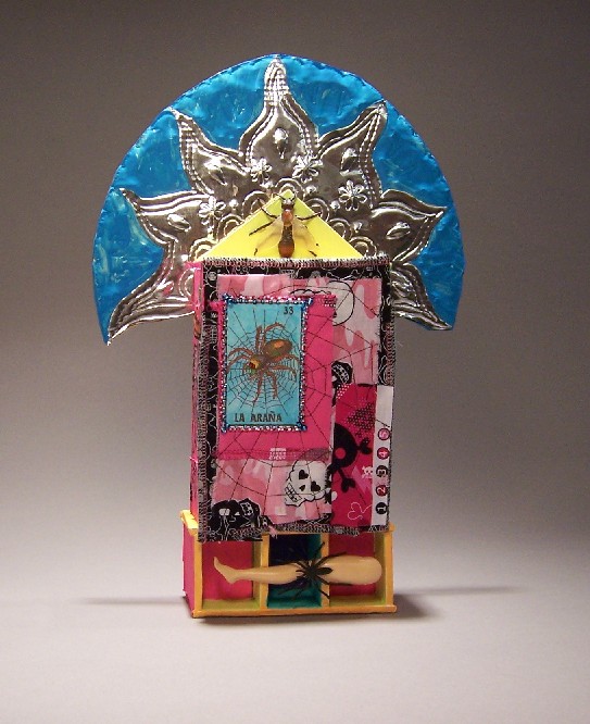

You can definitely see the Mexican influences in this piece. I found the Mexican lottery cards at a store in San Diego, and knew I had to incorporate them in a shrine somehow. I tried to catch the cheerful + morbid feel of Dia de los Muertos. I was going to go so far as to make small ‘sugar’ skulls to put in the niches at the bottom, but I found Tinkerbell’s detached leg when we were going through my girls’ toy bins and I thought that would be perfect. I had to cut grooves in the niche walls to glue it in.
Not shown: drawings on the sides of skeletons dancing in their folk finery. It didn’t show as well as I had hoped. Acrylic paint, if it’s glossy at all, is resistant to other media over it. I’m using gesso in another project for collage, and I hope it works better.
To get the blue/green “peeling paint” look, I painted blue underneath, and when it was dried, I smeared vaseline over it and painted the green on top. Then I wiped it off. That idea came from a book by Claudine Hellmuth.
The beads on the spider are sewn on by hand. The web was machine-sewed.
For the skull on the inside of the door, I made a stencil and sprayed adhesive. Then I lifted the stencil and poured the pink glass beads over the adhesive. Quite the mess, I tell you.
The black-and-pink frame around the corazon card is a piece of mat board. I cut slits in it and wrapped pink cotton twine around it to give the feel of spiderwebs.
For the semicircle/sun at the top, I embossed a sheet of tin. You can see my mehindi influences in the lotus-petal shape. Around the outside, I used some leatherworking stamps to add more texture. When it was done, it had too much of a hat shape and not enough of a sun shape, so I painted some of the tin turquoise.
What I learned from this project: Apple Barrel acrylic paints are cheap because they are poor quality. For this sort of project, I don’t really need thick tubes of Golden heavy bodied pure pigment artist acrylic, but Apple Barrel is below my threshold for useability.

3 comments
Hi, Kater.
Had a chance to look over your new stuff – it’s all really good, and I’m still very jealous of your ability to put this together – time is not my friend yet. The shrine is great! I’m inspired! And I really like the chicken cooker – what class, compared to the idea of shoving a beer can up a chicken’s ass and sticking it in a pot. 🙂
Well, done, dear.
Love,
Jane
I am an art teacher in orlando, florida. i am teaching grade k-5. My fifth graders are doing a box assemblage project. while researching, i came across your image “sweet and creepy” which goes along beautifully with some of the other retablo elements, i am composing into a video for the kids to see.
would it be possible to use that image in the video. it will also be on a blog and linked on youtube.
nice image, very nicely constructed. thanks for your time
Author
Sure thing! I appreciate link-backs, but I’m all about sharing my images, especially when it helps educate and inspire kids.