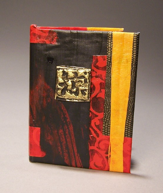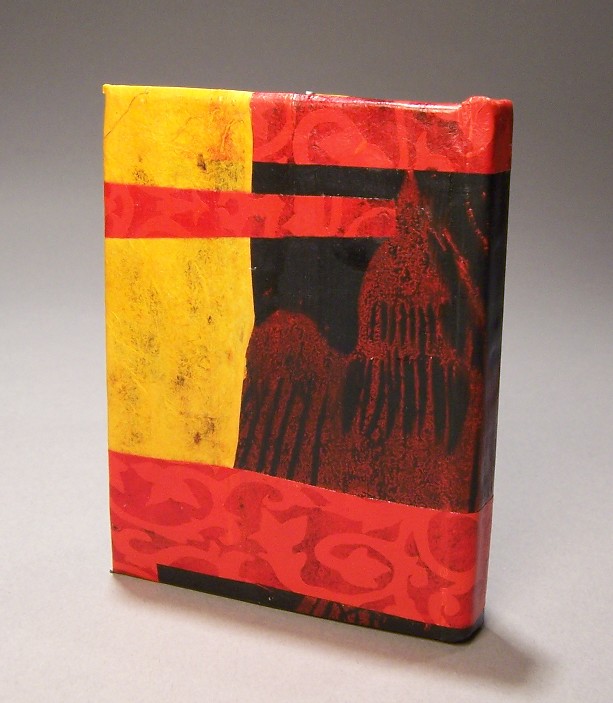


For the base of this book’s cover, I started with a piece of cotton cloth to which I adhered black paper with a block print of a swallow on it. I had some paper scraps left over from end papers from different books, so I adhered them onto the black paper with acrylic medium. I had a happy accident with the red paper, in that when you put it over black paper, using clear acrylic medium, the background paper turns transparent, bringing the design to the fore.
From a design aspect, this book worked perfectly. From a technical aspect, I had issues with it. The cover material, once the different layers of paper and acrylic are on it, is quite stiff. This is nice in that it’s sturdy, but it makes it very difficult to fold around the head of the spine. Also, even though I weighed it down as the glue was drying, it came up a little along the front cover, so the edge isn’t tight.
I was going to use a flat glass marble with a picture adhered to the back of it as a focal point on the cover, but it didn’t quite suit the dramatic design. Instead, I took an embellishment I’d made earlier out of a piece of translucent polymer clay stamped with the kanji. After I baked it I gilded it with gold leaf. All it needed was the black acrylic to bring out the depressions. So much of this kind of mixed-media art involves making things and keeping them for use with later projects. This is why my absolute favorite piece of furniture is my card catalog, stuffed with knick-knacks, embellishments, and some low-fired glazes for when I get my kiln working again. (Someday…)

1 comments
That’s another beauty. I am awed by your patience and artistry in making these.