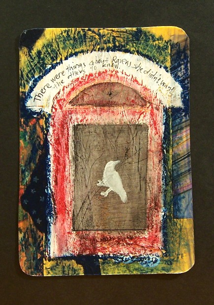
This was a learning experience.
Once again I started with watercolor paper, and wrote on it with a calligraphy dip pen. I wrote “There were facts about ravens she didn’t want the others to know.” Once again it became quickly apparent that plain writing on a white background is BORING. When I’d finished with the paint washes and tissue paper layers, the writing was completely obscured.
I’d added bits of other papers too, in keeping with the color theme. One is the washi with stars, one is he striped handmade paper, and one is the vintage domino ad. I saw something in a magazine where there were stripes of pretty paper arching over a box. I painted an arched rectangle with gesso, then looked for papers. The paper I had didn’t look right.
So, instead, I outlined the box with blue oil pastel. Suddenly the inside looked dull, so I drew inside it with the red oil pastel. Oil pastels look a lot like crayon, but you can smear it a little Smearing it helped. A little. I tried to draw outlines with sharpies and ended up ruining two sharpies. Sharpies do not like to draw on an oily surface.
I used a scraffito tool to scratch branches in the center of the rectangle, and a small figure in the transom arch. Then I painted on the gesso with India ink and wiped it off. That did not quite have the effect I had hoped for. I was going to gesso a bird outline so I could paint it in with acrylic later, but once I’d painted the white bird I decided that was okay.
The writing at the top of the arch, in my opinion, was a disaster. First of all, I misquoted myself. Secondly, despite being afraid of ruining another sharpie, no other pen writes well on gesso. Thirdly, my lettering was terrible.
But the purpose of this project is not to create a series of masterpieces, it’s to practice and get better at mixed media.
Good news, camera tripods can hold spotlights too, which is good, because you apparently want a spot that is some distance away from the piece so as to avoid glare. I’m still not 100% happy with these photos. Bad news, the spotlight clamp has a tendency to scratch the top of the tripod. I have a plan for a better design, but it involves some things which may or may not exist at the hardware store.

1 comments
I like the direction this is taking. Of course only you can decide whether it looks the way you want, but to my eye, it’s pretty awesome. (And I love the caption on the arch… I think “things” sounds less prosaic than “facts.”)
I also admired the two previous pieces.