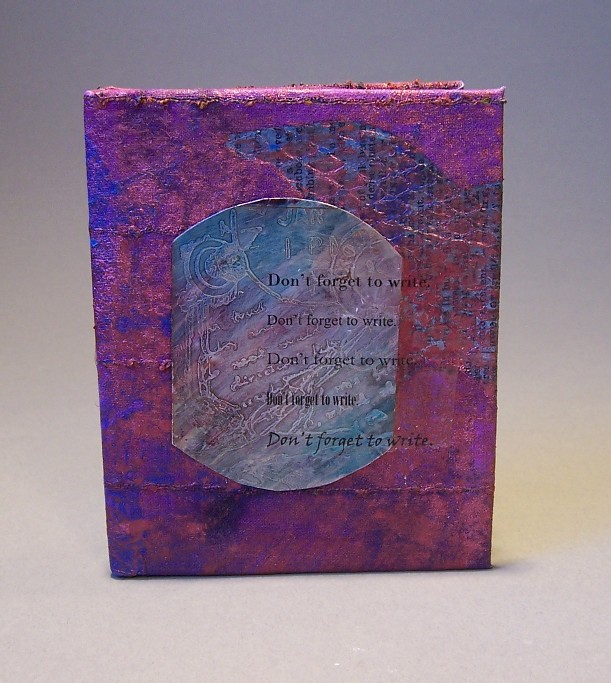
 This book started, once again, with light cotton cloth adhered to an old photocopy. The photocopy was of a dictionary page with the word “swift†on it–used for another project—but you can’t see it very well now.Â
To let the image show through, I cut out twin silhouettes of flying swallows before adhering it to the paper. After that, I used one of my linoblocks and printed a flying swallow in blue-violet paint right in the middle.
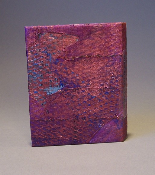
This was a good start, but it wasn’t enough. Using acrylic medium, I pasted the plastic netting from an onion bag onto the surface. It was already blue in spots from working on the Strive book. This looked terrible. It looked like an onion bag glued to an otherwise promising painting. I tried putting fuchsia mica pigments over it. Still looked bad. Smeared the mica pigments in. Still looked bad. By now, the paint was starting to dry. It was just wet enough to tear the onion bag off without ruining it.
Tearing off the onion bag produced a dragon-scale like sheen. Not bad. Almost interesting enough to hold its own, with a focal point. I’d saved my favorite embellishment for this book because this book started out as my favorite.Â
The metal plate was a piece of aluminum flashing that I’d cut, masked, and etched with a rubber stamp and some PCB etchant solution. PCB etchant solution etches aluminum wicked fast, so if you try this at home, watch it closely. Muriatic acid also does a good job, supposedly, and pool chemicals are more readily available, so that project will make it onto this site at a future date.
The etched piece of metal began as a square with a border, then turned into a circle because a square wasn’t interesting enough. A square design inside a circle wasn’t much better, so I trimmed off the sides. I used alcohol based inks to tint the metal, and steel wool to bring out the design again. One mistake I made was to use white glue to adhere it to the book. Hot glue doesn’t stick well to metal, and gorilla glue has proved to be as strong as spider spit and wishful thinking (read: a waste of money), but I didn’t have anything else and thought that metal brackets wouldn’t have the right look.
What may help keep the plate on is the tape. By now I’d figured out the theme of this book, “Don’t forget to write.†Instead of a plea to keep in touch, it’s a reminder that if you’re a writer, and writing is important to you, you have to remember to find time in your life for it.Â
To make the transfer, I started by writing the phrase and experimenting with different fonts and sizes, then printed it out with a laser printer. I centered a piece of packing tape over as many as would fit and burnished the tape to the paper, then set it in a tub of water to soak. Once you rub all the paper off the tape, only the toner remains. When it dries, the tape becomes sticky again. The plan was to cut out just one of them and center it on the plate. Practical considerations indicated that perhaps all of them were better than just one. The tape helps keep the plate down. The phrase that didn’t fit on one piece of tape fit on another one, so I stuck it on the spine like a title.

1 comments
This one’s beautiful!