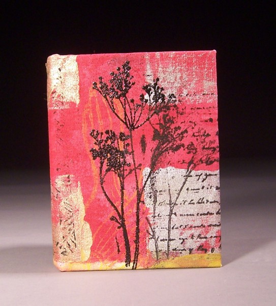
I think I like this best of the books in the rainbow series. It’s predominantly red, which is one of my favorite colors, so that’s part of it.
This was one of the first ones I finished, so I wasn’t terribly concerned about making it that different. I decided to just go with the background as is, and use a strong design as a focal point. This is a commercially purchased stamp that I like quite a bit. I think I like it in part because it resembles the weed-motif I used on the dark clay cups I made last year (inspired by a photo I took in Missouri.)
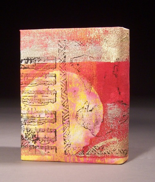
On the back you can see part of the writing (commercially purchased stamp) and the crows with the basketweave border (linoblock I cut years ago.)


