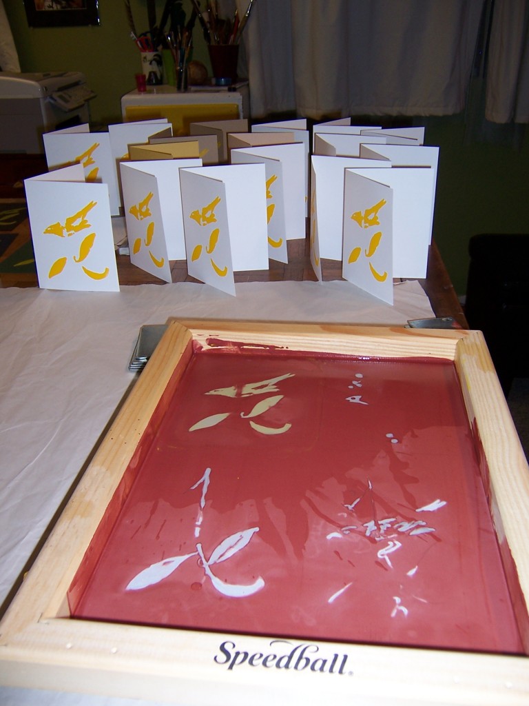
My sister-in-law gave me a silkscreening kit that included this generously sized silkscreen frame. Since I don’t usually do art this large, I decided to use the screen for four different shots so that I could try my hand at a multi colored silk screen.
I started by looking for something inspirational. Since I have a thing for birds, I used an old Audobon print as reference. I wanted something colorful and simple, that would make up use of white space. I preferred to do something in the colors of blue, brown, red, and black (which are the colors of block printing ink I own) but couldn’t think of anything. I settled on this tanager, and decided that I would use acrylic paint mixed with the gel retarder I bought for silkscreens.
Doing the four different colors wasn’t very hard. I sketched it out and just moved the silk screen over my sketch to sketch out the different colored layers. I used the drawing fluid, which serves as a mask for the red ink mask, a two step process that they describe in the kit as a simpler alternative to photo emulsion. They also say you can just paint the red ink mask/resist directly on the silk and skip the blue drawing fluid entirely. I think this might be a better idea. By painting on the red ink mask directly, I could get more control.
Mixing the acrylic paint with the retarder worked great. Not only could I create the exact shades I wanted, but the acrylic is waterproof when it dries. I use water clean up block printing ink when proofing my silkscreens (and for linoblocks) and one of its drawbacks is that it runs when damp. The gel retarder really slowed down the drying time (which is what you want it to do) so I had to wait overnight between color prints.
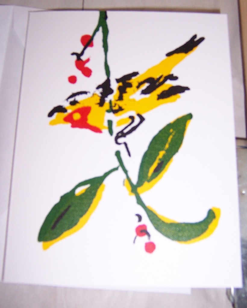
Now for the major drawback: since I was using different sizes of paper, and since each image was oriented imprecisely on the silkscreen, I had to line up the subsequent color proofs by hand. Sometimes, this made for “interpretive dance” style silkscreen prints.
This photo isn’t very good, sorry. You can see how off the colors are. They remind me of sheets from the sixties and seventies, or cheap cartoons.
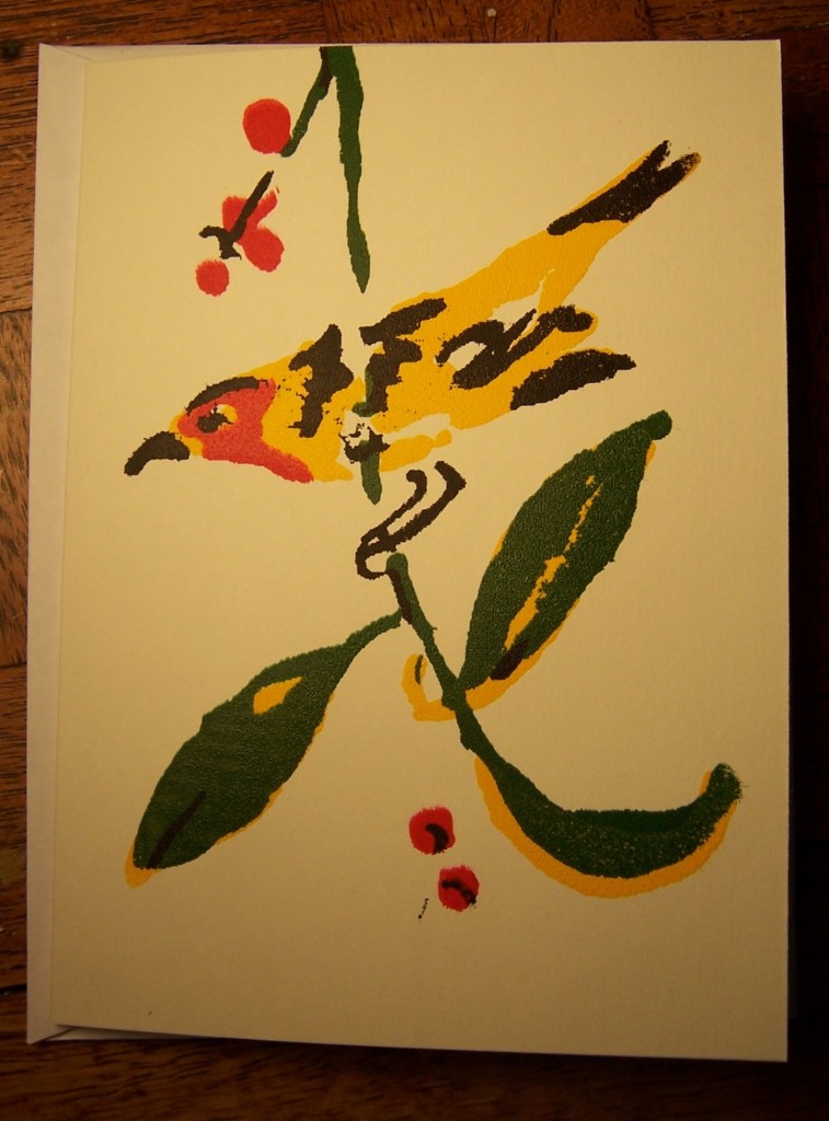
I think to make them lined up, I’d have to have paper that was all the same size, that fit into a frame. I’d also have to have a single image per silk screen. This is kind of a pain, because cleaning off the red stuff is the biggest hassle, and because it takes a few hours for each layer to dry. It took close to two weeks from conception to finish to make these cards. Here’s one of the better ones.
I think in the future, I’ll stick more to single-color prints, maybe on colored paper, which I then collage.


