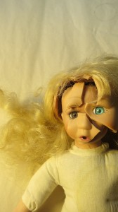
This was one of my first publications, and you can see I kind of struggled with learning how to use gimp to make the cover. The ones on the left were much smaller, and I decided I’d scroll through my photos and find something brightly colored and interesting, then make sure that my name and the title were on it. The later ones I decided not to put my name on it, since I figured you’d get that in the metadata, and I wanted it as legible as possible at a small size. Now I’m thinking I should have put my name on that cover as well. Oh well, maybe change it later.
I am very happy with the doll. “Emily’s Fifth Birthday” doesn’t have a doll, but it has a girl who stays five for a long time. Obviously, a five-year-old girl would make a great cover model, but when I looked into stock photos, I quickly learned that any stock photo worth using for a cover costs way too much. The more interesting, the more expensive. Also, getting model releases isn’t easy.
I wanted something that made people think of children, and felt a little unsettling. First I went to Goodwill and bought as many dolls as I though worked. My original idea was to have a bunch of doll heads together. I’d seen that somewhere and it had the look I was going for. I tried assembling them, rearranging them, and then I thought about just using the head. I took the bigger doll to the second floor and let her take a header off the railing. Tragic ending. I’m not sure what sparked the idea of a doll inside another doll, wearing the skin of another like Buffalo Bill from “Silence of the Lambs,” but it worked. I took a smaller doll and removed her hair, then assembled the pieces of the larger doll’s face over hers. I hadn’t intended the photo to have that golden tone, but sometimes the camera has a tonal auto-correct.


1 comments
This is shockingly eerie, even after you explained how it was made!