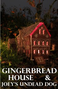
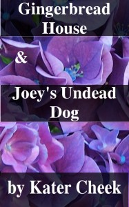
The photo at the bottom is the original cover for this pair of short stories that I published last year. The stories are both horror + comedy, a sub-genre I’ve had some success with. I chose the close up of the stock because I just wanted a photo (that I owned the rights to) that was bright and attractive, as a placeholder instead of the “you don’t have any cover art” image they use. Now that I know how hard it is to change covers after the fact, I strongly recommend having good cover art before you publish anything.
Gingerbread house is an epistolary about baker contestants living in a house made of Gingerbread in the middle of nowhere. Things begin to go badly for them. Joey’s Undead Dog is about a boy who suddenly develops necromancy powers.
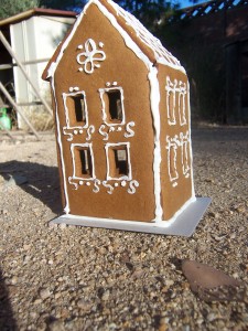
So, I wanted to make a nice cover, something interesting and creative, that was a level of art worthy of the stories. I love making gingerbread houses, and have done so often enough that I understand how to make a pattern and bake something that will work. I made the tiny one first. It’s adorable, and I loved it, but it wasn’t elaborate enough. Also, just having a picture of a gingerbread house taken in bright sunlight wasn’t that fascinating.
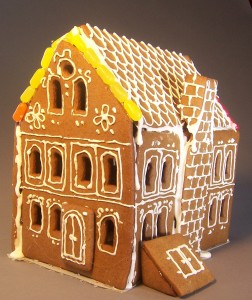
So I made a bigger gingerbread house. This one has more eaves and gutters and piping, and a cellar door. Something I found about piping frosting (and yes, that is f rosting) is that not only is it super-hard to squeeze it out of a jacquard bottle (and pre-packaged refrigerated decorator icing is nearly impossible) but it’s even hard to fill the jacquard bottle in the first place. I got a syringe and started to fill the bottle with that, then realized that using the syringe itself was the best way of getting the frosting out.
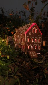
Because the cookie pieces tend to warp when they’re baked, I had to fill in the eave gaps with Mike & Ikes. I bought other candies too, but those are pretty much the only ones I used. That turned out to be a nice touch, because of the way it added color when we put the tealight inside. (cut a hole in the cardboard base). The first photo we did turned out even better, but it was landscape instead of portrait and when cropped, it was just too small for the large sizes required by the epublishing sites.
I took the picture outside, in a part of my garden that had some tiny plants growing up through the gravel. I love the way they look, as they make the small (maybe 12″ tall) house seem larger.
If you want to read the stories (they are free on Amazon) you can click here to get links to my fiction, or click here to get this story directly from Amazon. Be sure to write a review.

1 comments
That’s a brilliant cover! Definitely worthy of the story.