One of the things I’ve discovered about my self-publishing adventures is that you occasionally need a different ebook cover from the paper cover. The paper cover is for a 5.5 X 8.5 inch object that will be held in your hands. The ebook cover will be maybe an inch by two inches at the most. So it needs to be…not exactly simpler (since it still has to be a very high resolution) but the composition needs to work well in a small space.
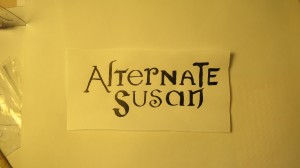
You can see the paper version of this cover here. It’s considerably more complicated. I wanted the eversion to have fewer elements, but the same feel and look and color scheme. So I made a small box. The original has a large, elaborate shadow box filled with things I made. This box is perhaps 4×5 inches and 1 inch deep. I used the same lettering I”d used for the original title (paper at the top) then photographed it and cleaned it up in Gimp.
After that, it was just a matter of choosing which elements from the origina to use and assembling them. One of the issues I worked with on this was how big and whether or not to include my name. I figured that if you purchased it, it would be from a site that had the author’s name prominently positioned. Then again, sometimes I’ve bought books and found that the author data was (inexplicably) not included in the meta data (along with a synopsis and other descriptive materials–what gives, Kindle?) So I compromised. I don’t think I’m Patricia Cornwall or Tom Clancy stature, where my name deserved to be as big as the title, but I did want people to see it.


