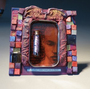
This started out being the least favorite of my three shines that I made, and turned out to be the most favorite. My goal was to try to use different materials for the surrounding frame, and decide which one was the best. For this one, I used two part epoxy paste. It comes in a tube with blue on the outside and white on the inside. I used it to good effect to repair a broken porcelain sculpture, but I’d heard you could sculpt with it too, so I wanted to try.
Results were mixed (pun always intended.) The epoxy is kind of sticky, and it leaves a residue on your fingers. Also, it left a residue on the wing stamp, which displeases me greatly as it’s one of my favorite stamps. I still don’t know if it’s ruined or not. After I squished it around the edges of the tin, I let it sit to cure.
One of the heuristics I remember when creating mixed-media art is that when in doubt, pick a color theme. A piece with a good color theme will almost always look good, even if the elements are somewhat disparate. So I chose orange and purple, the hues closest to red, and figured I could use traces of red to tie them together. I cut and pasted some art paper with white print on black, then used a scarlet ink to stain the white text red. You can barely see it under the resin. Then I painted the epoxy purple. When it dried, I rubbed mica pigments over it to bring out the detailing.
Then I looked around my studio to see what I could use as tiles to fill in the rest of the frame area. I had the gold-backed tesselae I made (spray-adheseive and gold leaf on window glass, cut into small tiles) and I had a few square glass backsplash tiles. And then I had a couple bins of mosaic tiles from a kid’s kit. They’re porous and light, with a texture halfway between chalk and pumice. They have unappealing pastel hues, so I hadn’t used them before. But I have a lot of brilliant ink samples from the fountain pens (which have broken my heart time and time again. Nothing breaks as consistently as a fountain pen.) I broke up with fountain pens, so I sacrificed the ink to stain some mosaic tiles. The porous material took the ink very well.
I knew I wanted to use a bottle in the resin, and I have some borosilicate bottles I’ve made, but they were too much for this, and not cappable, even if I had a variety of cork sizes. But I do have some small bottles I purchased, I think from the Tim Holz studio. I thought I wanted to put a strip of paper in it. I cut up some sentences out of pages I cut out of a book. One of the slips of paper formed the sentence “That’s what I didn’t want you to know.” I stuck that on the bottom of the cardboard. I had some other tiles I’d made with letters on them, out of violet polymer clay. I picked out the letters to spell “secret” and used them on the left side of the mosaic. After arranging and rearranging until I liked the way they looked, I glued them down. Some iridescent blue and violet glass beads filled in the cracks.
The inside of the tin was going to have resin in that. I knew that from the beginning. And also the bottle, with another sentence, which I stained violet to match. But it needed something else. It needed a focal point, something good. I used to draw, but I don’t so much anymore. I don’t like my drawings. Even my chicken drawings are kind of silly. Someday maybe I’ll focus on drawing again and build my skill up to the point where I’m not ashamed of it, but I wanted to finish this project.
So, I don’t do much 2-D art. But I do hoard calendars from people who are better artists than me. One of them was this mini Rumi calendar with prints by Matt Manley, whose work I adore. I buy these calendars even if I already have a calendar, just for the prints. I usually don’t like to co-opt others’ work for my own, but in this case, I couldn’t resist. I cut the man’s silhouette out of the calendar and glued it down on the bottom of the tin, then poured in the resin and half-submerged the bottle with the message in it.


2 comments
I really like this one. The bottled message and the expression of the figure really covey the theme.
This is deeply beautiful. Great work.