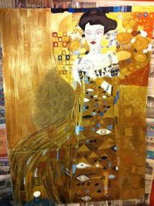
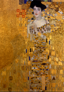
I included the original again for comparison. By the way, this is only a piece of the original. I cropped it to fit, because I wanted the head to be the same size as my head, for reasons I will explain later. It’s a shame, becuase you miss out on the beautiful green part, but it’s still pretty.
One of the nice things about seeing Klimt in the original is how sparkly and multi-dimensional the gold is. The colors are so vibrant and amazing. You really never get that kind of depth with a print, so it’s odd that Klimt is such a staple on dorm-room walls.
The left part of the skirt continues to be an issue for me. It’s got pale grey and blue in there, but mostly it’s gold. The main part of the skirt is also mostly gold, but it has those eye and triangle shapes. One can’t help but come to the conclusion when doing a project like this that Klimt cared a lot more about his shapes and images than he did about the person he was painting.
I’m especially proud of that dark area to the left of her waist. I mixed the greyish blue and painted it over, then waited until it was partially dry, and then removed some swirls. I also mixed the red with the gold and did a wash over the far left of the painting, using the texture of the corrugated cardboard to simulate the speckled/mottled texture of the original.
In the center of the dress and the right of the dress, I had to layer over more color. Metallic brown in the middle and metallic gold on the right. The cheap paint is so thin that every layer is basically a glaze. That’s one of the problems I had with the skirt on the left. it needs distinct strokes, but that’s hard to get with thin, weak paint.
I keep touching up the patterns in the upper right and left. The picture I’m working from is on my phone, so it’s hard to get details.


