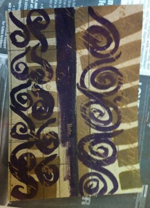
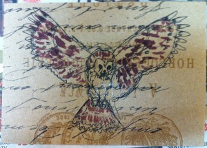
I used some of Tim Holz’s interesting Kraft scrapbook paper as a base here. The thing about this paper is that the design itself isn’t very noticeable until you paint over with ink or a paint wash. Then the resist-printed design shows through. I did the sketch on the left and the owl on the right. The one on the left doesn’t work very well because it’s just not done well, and the one on the right, well, I guess the same reason. Something about the form of the beak of this owl made it hard to get accurately.
But, in the interest of honesty, I decided to post my failure postcards as well as the ones I’m proud of.


