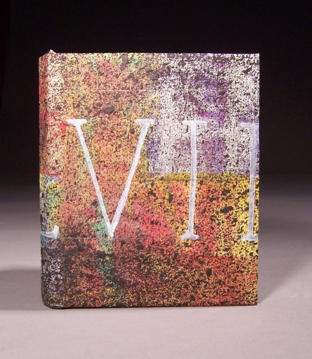
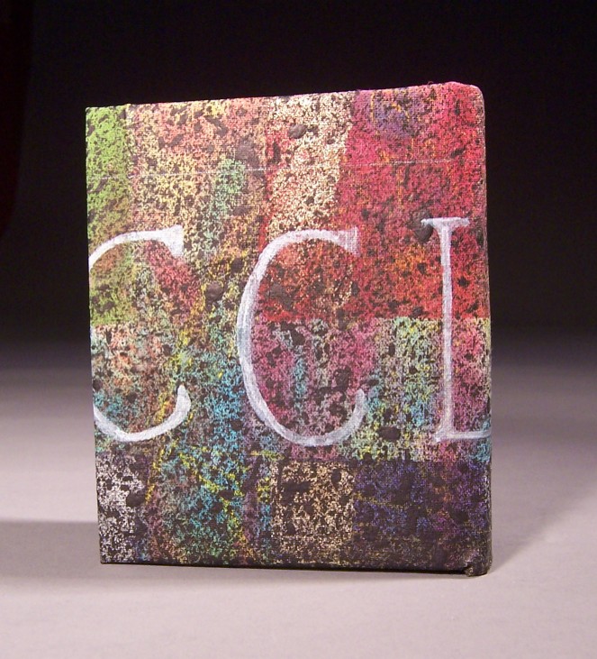
Inspired by the previous book in the rainbow series, I decided I wanted to do some more lettering. It used to be that people who painted signs and drew ads had to paint the letters and numbers by hand, and they had to use both precision and creativity in designing their own fonts. I wanted to use a Roman font for this, and I wanted something simple enough that I could showcase each letter without overwhelming the overall design with a too-understandable word. So I chose my lucky number, in Roman numerals. Half of it is cut off, but that doesn’t matter. You don’t need to know what my lucky number is.
For the background, after I finished masking and washing with color, I needed some way to tone it down. The other books came out so colorful that I was having trouble differentiating them. So I used a toothbrush and some black acrylic paint, and splattered it. To me, it looks a little like something out of the eighties. I seem to remember that splattered look being popular.
I used a sharpie paint marker for the letters. I’m not sure I quite like the sharpie paint markers. They’re fussy, and not as opaque as I’d like, so I’m not sure they’re more accurate than a brush and some paint or gesso. I have them now though, so I ought to use them.


