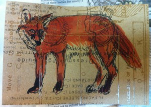
This is a slightly-more-successful postcard, even though I don’t like the way the nose worked out. Also, I should have made my sketch lines more sketchy, because you can see the shoulder and hip circles I drew when I was figuring out the proportions. I do like the orange color. I’m quite fond of foxes.
Mar 31
Book Review: Being Mortal
Being Mortal: Medicine and What Matters in the End by Atul Gawande I’d read an article that this book was based on, about the need for more geriatric doctors, and I’d read another book by Atul Gawande, so that pretty much sold me on this even before I kept seeing it popping up everywhere. This …
Mar 30
The Owl and the Ugly
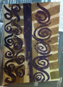
I used some of Tim Holz’s interesting Kraft scrapbook paper as a base here. The thing about this paper is that the design itself isn’t very noticeable until you paint over with ink or a paint wash. Then the resist-printed design shows through. I did the sketch on the left and the owl on the …
Mar 20
Sparrow Sketch
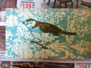
This sparrow sketch would have worked great as an independent image, that is, if I had cut it out from the paper and pasted just the bird onto another background. I should probably still do that. I love when other people do that kind of combination of patterns and illustrations, but I just didn’t. I …


