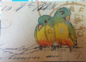
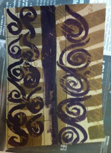
The owls were obviously meant to be part of a collage, since I drew them on opposite sides of the paper so I could maximize the resist. But they are so busy that the resist pattern doesn’t add much. Also, I find owls hard to draw sometimes. Their faces don’t lend themselves well to it, …
Category: Art
Apr 08
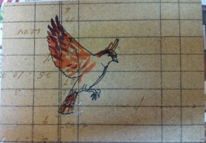
Flying Sparrow on Grid
This is one where the drawing was fine enough, but it missed so much of the background resist pattern that I might as well have not drawn it on anything. I suppose I could “rescue” it by doing a background wash to make the figures show up more. Or maybe it’s fine the way it …
Apr 06
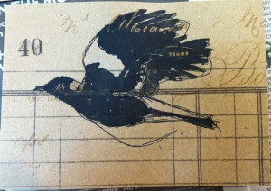
Magpie Postcard
This is another postcard where I sketched the bird on the printed-resist paper and then filled it in with ink later. You can see the script in the magpie’s wing. I used white ink on the white patch on the wing and the neck and tail, but it’s very difficult to tell, which makes me …
Apr 02
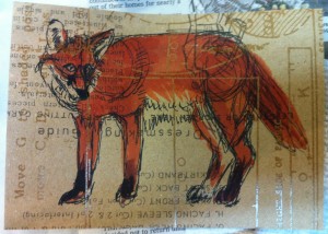
Pattern and Fox
This is a slightly-more-successful postcard, even though I don’t like the way the nose worked out. Also, I should have made my sketch lines more sketchy, because you can see the shoulder and hip circles I drew when I was figuring out the proportions. I do like the orange color. I’m quite fond of foxes.
Mar 30
The Owl and the Ugly
I used some of Tim Holz’s interesting Kraft scrapbook paper as a base here. The thing about this paper is that the design itself isn’t very noticeable until you paint over with ink or a paint wash. Then the resist-printed design shows through. I did the sketch on the left and the owl on the …

