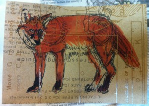
This is a slightly-more-successful postcard, even though I don’t like the way the nose worked out. Also, I should have made my sketch lines more sketchy, because you can see the shoulder and hip circles I drew when I was figuring out the proportions. I do like the orange color. I’m quite fond of foxes.
Tag: tim holz
Mar 30
The Owl and the Ugly
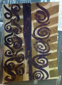
I used some of Tim Holz’s interesting Kraft scrapbook paper as a base here. The thing about this paper is that the design itself isn’t very noticeable until you paint over with ink or a paint wash. Then the resist-printed design shows through. I did the sketch on the left and the owl on the …
Feb 09
Honeycomb Wren postcard
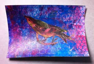
I made this by starting with a piece of some of Tim Holz’s paper that’s white with a pattern printed in resist. The pattern is the larger honeycomb you see there. I layered it over with blue acrylic, and also used a rubber stamp with honeycomb to put the smaller honeycomb pattern on there. To …
- 1
- 2


